Event Analysis
1. Case Introduction
We often need to analyze "New Users" and "DAU", and we can use the Event Analysis function to analyze these two indicators.
1. Determine the indicators and screening criteria: To analyze DAU and new users, display them on both iOS and Android.
Click on "Select Indicator", in the pop-up window we select the event and filter criteria, and rename the indicator (we can also set the filter criteria in the main screen of event analysis).
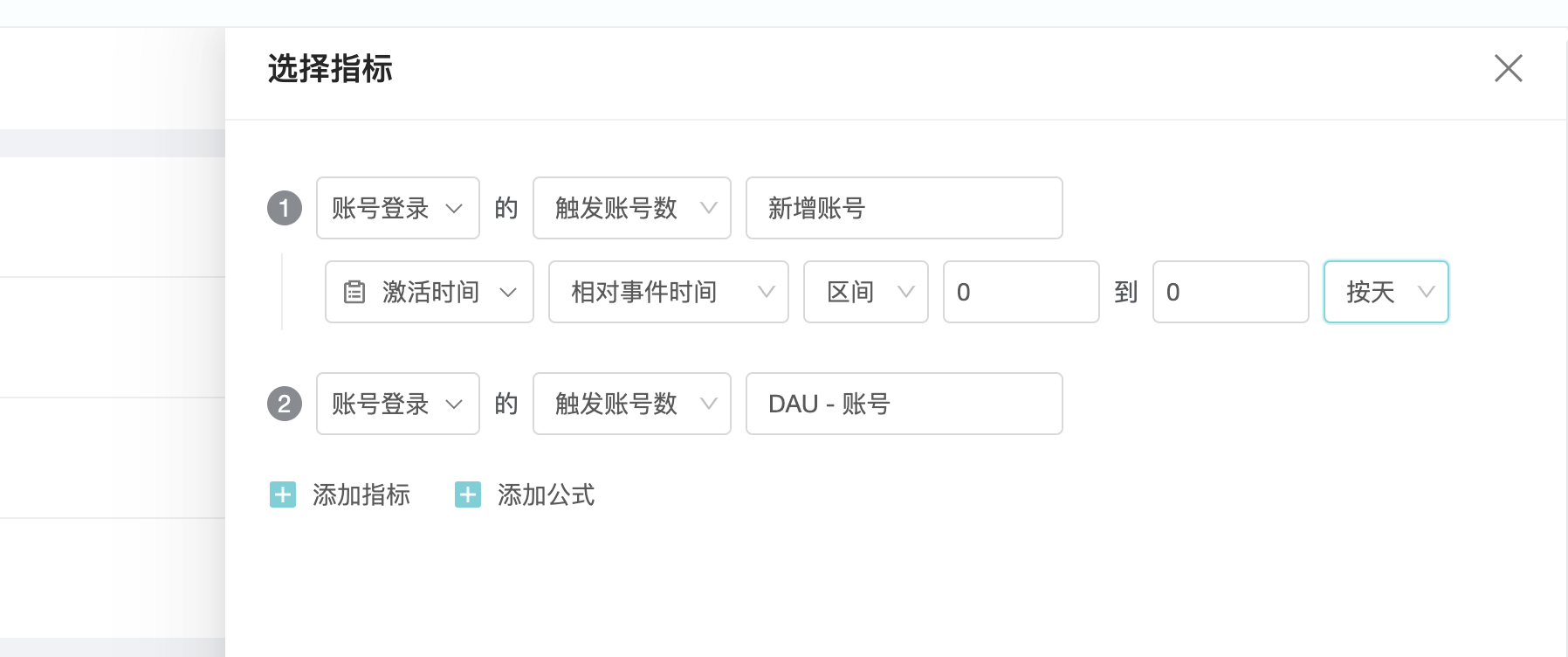
2. Determine the dimension:The iOS and Android platforms are the dimensions we analyze, so we select "Device System Type" in " Select dimension".

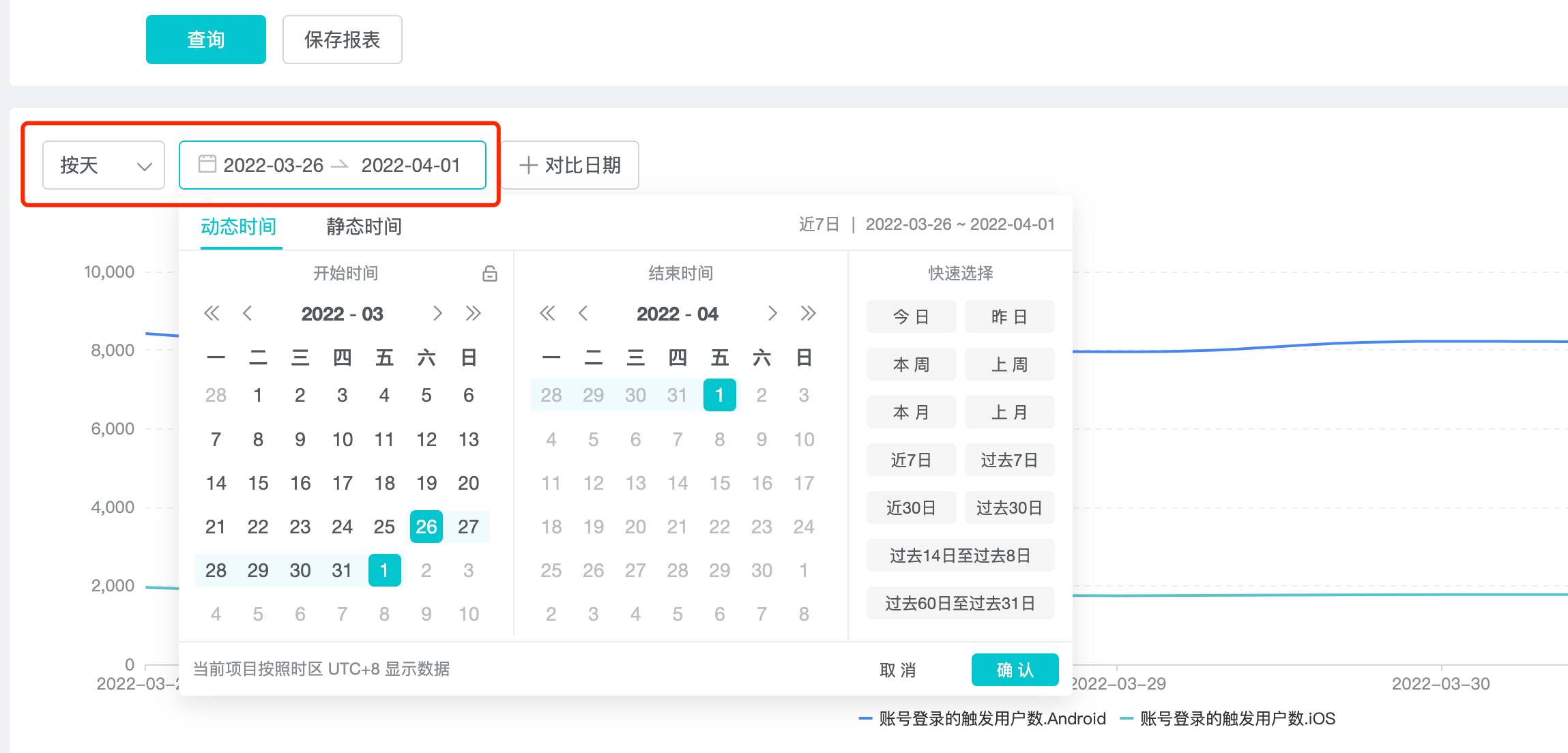
3. Select time period:We need to focus on the last 30 days of data changes, so select "Past 30 day" in the date selector.
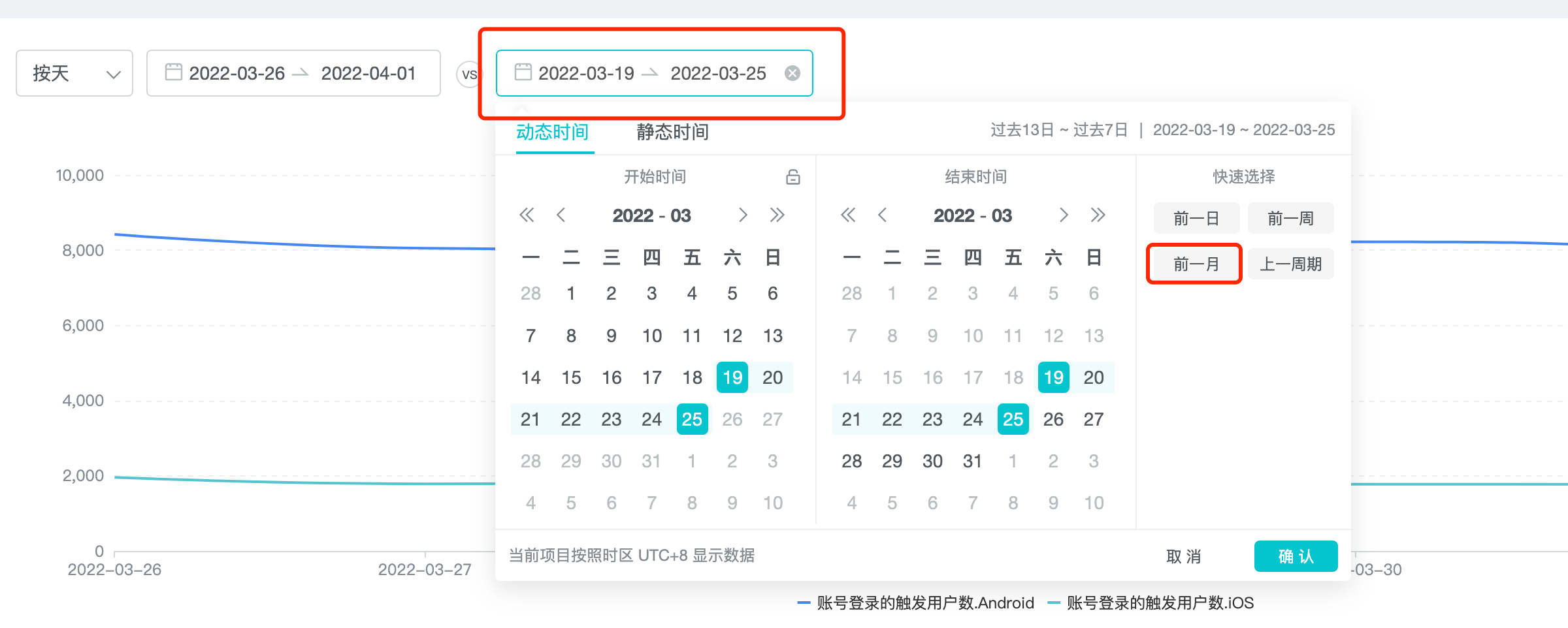
4. Select a comparison time period:We use the last 30 days of data changes, compared to the previous month.
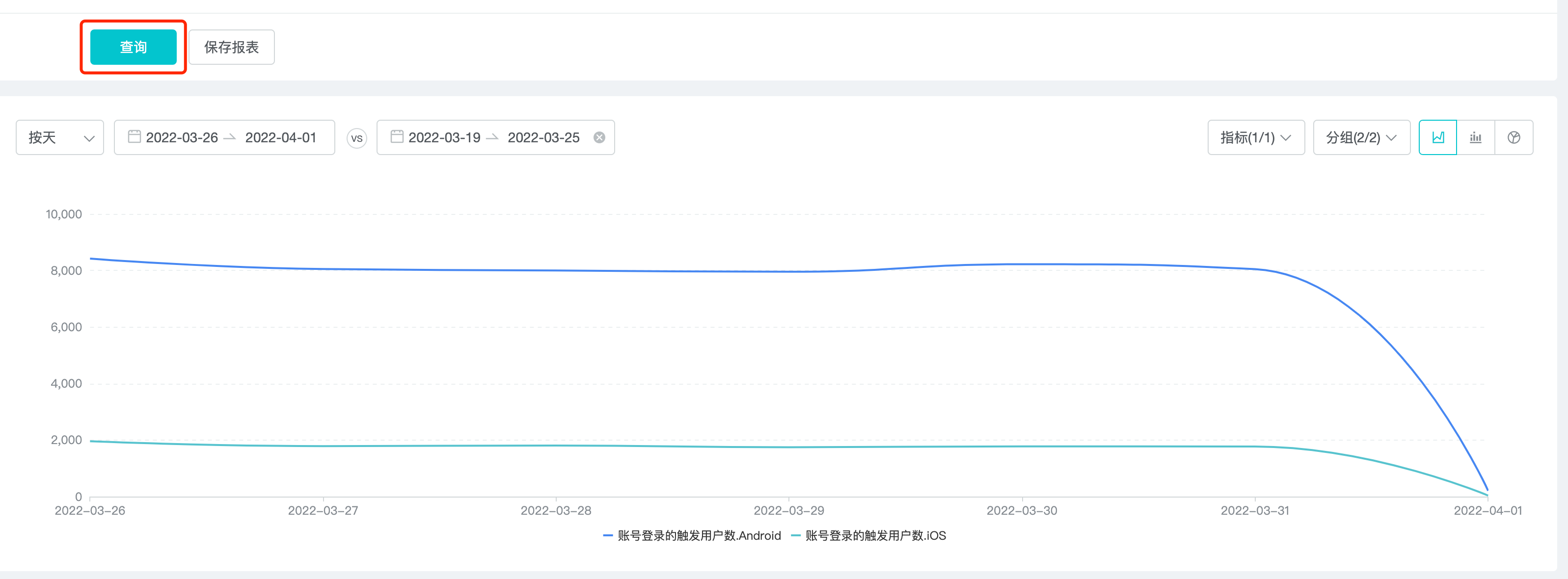
After setting the conditions, click "Inquire" to output the results.
5. Save Report:We save the query results as a report. The reports are then transformed into a dashboard, which makes it easy to see the final report data every day.

These are the steps to view daily users through event analysis。
2. What Is Event Analysis
Event Analysis is to analyze the what, how, when, and where of an event.
3. Use Cases For Event Analysis
- Number of people: how many people triggered the event.
- Trends in UV and DAU;
- For example, the description of a button is adjusted, before the adjustment is A, after the adjustment is B. Conduct a control test to analyze the click situation of A and B.
-
Times: how many times a certain event was triggered, such as the number of passes on a level per day.
-
Per capita times: how many times an event (behavior) is triggered on average.
-
Active ratio: the ratio of the number of people who trigger an event to all active people in a time interval.
-
Data under the event segmentation dimension: for example, by device type, we can see how many button clicks happened on different devices.
-
Four calculations for complex indicators: What happens when the data we want isn't in the reported data? We can add, subtract, multiply and divide indicators to get a new indicator, this way is called custom indicator, such as ROI, ARPU.
4. How To Do Event Analysis
Just like the 5 steps mentioned in the case above:
1. Determine the indicators and screening criteria
2. Determine the dimension
3. Select time period
4. Select a comparison time period
5. Save Report
4.1 Select Indicator
When determining the Indicator, it is also necessary to determine whether to enable "Approximate calculation".
4.1.1 Approximate Calculation
When the Approximate calculation is turned on, only some of the samples are queried, with 99.9% accuracy and faster query speed.
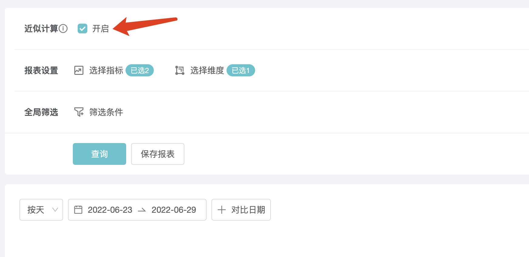
You need to click the "Inquire" button to make it effective.
4.1.2 Select Indicator
In the Select Indicator screen, it includes "Select Event", "Select Property", "Rename", "Copy indicator ", "Switch into indicator formula" and "Indicator screening" functions, as shown below:
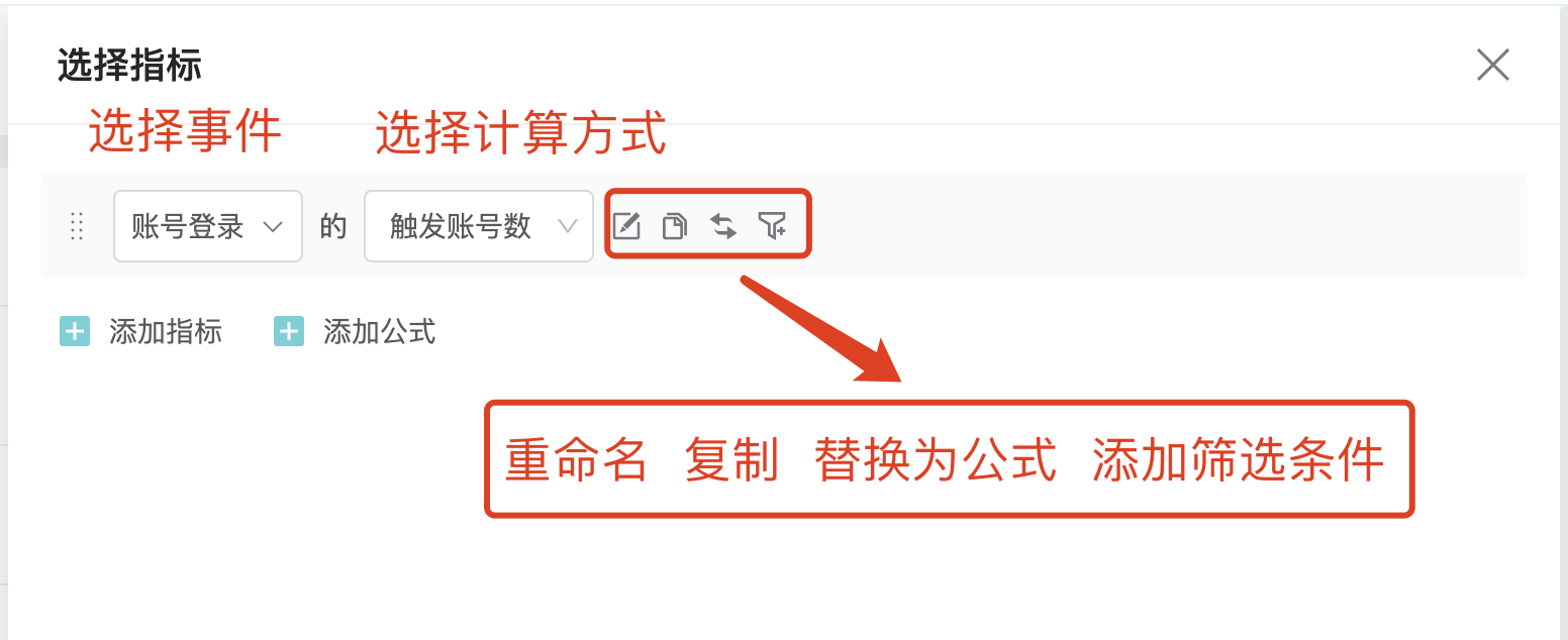
Select Event:Drop-down option to select all pre-set events and custom events.
Select Properties or Indicator Name": The drop-down option displays the analysis dimensions and Properties of the event, as follows.
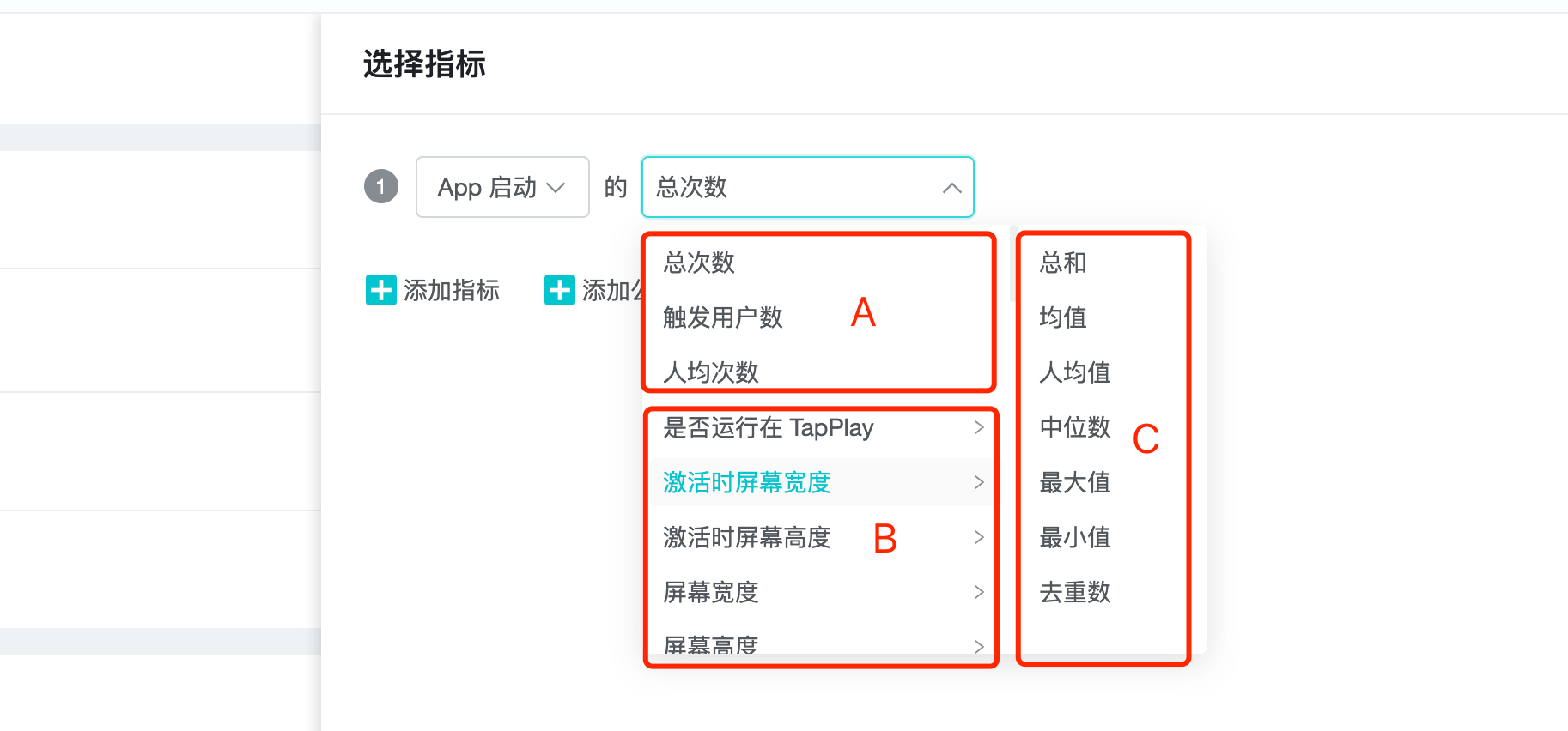
A. Analysis indicators: any event has at least these three analysis indicators: total number of times, number of triggering users, number of times per capita.
B. Properties: event properties.
C. Properties analysis indicators: According to the Property value type, the following analysis indicators can exist:
| Value Type | Analysis Perspective |
|---|---|
| Number | Total, median, mean, maximum, minimum, per capita, deduplication |
| List | Deduplicating lists, deduplicating list elements |
| Boolean | Deduplicated, true, false, null, not null |
| Non-numeric, Boolean | Deduplicated |
Time (supported formats are yyyyy-MM-dd HH:mm:ss or yyyyy-MM-dd HH:mm:ss.SSS) | Deduplicated |
**Rename **: Take care to use an easy-to-understand description.
Switch into indicator formula: Click to switch indicator formula. This feature is useful for special scale analysis scenarios, such as:
- The ratio of active users that day to active users that month. In this scenario, the number of active users in the month is used as the denominator to participate in the calculation.
- The ratio of the number of paying users for the day to the number of active users for the selected time frame. In this scenario, the total number of active users in the selected time range was used as the denominator to participate in the calculation.
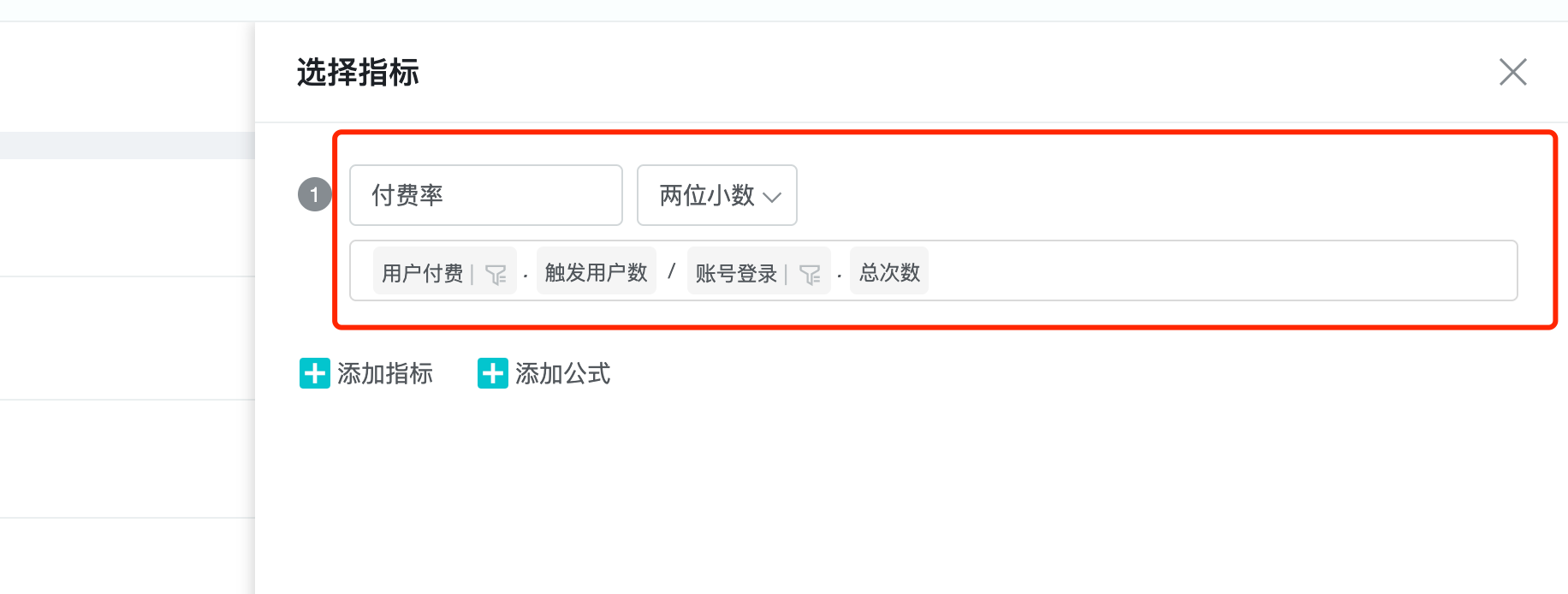
For example, we build a pay rate indicator by using the indicator formula
- A custom indicator named "Paid Rate".
- Set the event and indicator formula "user payment - number of triggered users" / "account login - number of triggered users".
- After setting the metric formula, we can choose "percentage", "two decimal" and "integer" presentation styles, we choose two decimal.
4.1.3 Indicator Screening
It is used to set the restrictions of indicators. You can set the filter for individual indicators in the "Indicator Selection", or set the global filter in the main event analysis screen.
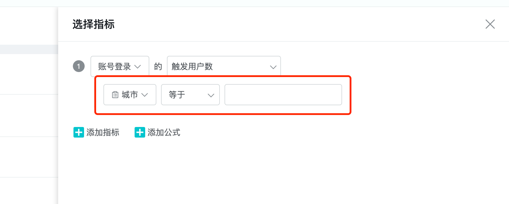
4.1.4.1 Screening Data Types
There are 5 types, each supporting a different mathematical logic.
-
Number. e.g.: recharge amount. Support mathematical logic: equal to, not equal to, less than, greater than, with value, without value, interval.
-
String. For example: the city where the event occurred. Support mathematical logic: equal to, not equal to, contains, does not contain, has value, no value, regular match.
-
List ID. e.g.: list. Support mathematical logic: presence element, non-existent element, element position, with value, without value.
-
Time. e.g.: registration time (yyyy-MM-dd HH:mm:ss.SSS or yyyy-MM-dd HH:mm:ss). Support mathematical logic: absolute time, relative to the current time, relative to the moment of the event, with value, without value。
-
Boolean. e.g.:: Wifi use. Support mathematical logic: true, false, with value, without value.
4.1.4.2 The difference between equal to / not equal to and including / not including
Equal/Not equal: filter items that strictly match the selected value. For example, if the sub-continent is equal to America, then only the data for the Americas will be queried.
Includding/Not including: the filter item contains the selected value can be filtered, such as the subcontinent contains the Americas, then the data of the Americas, North America, South America can be filtered out.
Absolute time: refers to the objective real time. For example, 2021-03-02 19:24:52 to 2021-03-08 19:24:52, the former time must be before the latter time. Click "Select time" to select seconds.
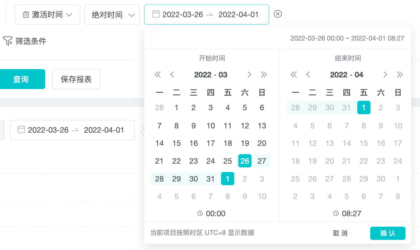
Relative current time: The last n days relative to the present.

Relative event time: The n days before and after the selected event. A negative number can be selected here, such as -1 day, which means the day before the selected event, and a positive number, such as 1 day, which means the day after the selected event.

4.1.4.3 "And" & "Or"
Multiple filters can be added. When there are at least 2 or more filters, the And / Or toggle button will appear, and the default is "And". "And" is the intersection of multiple filters, and "or" is the concatenation of multiple filters.
After selecting the filter, click the query button to take effect.
4.2 Select Dimension
4.2.1 Dimension
A dimension is a decomposition of facts that splits metrics to observe patterns:
"Country where the event occurred" is a dimension that groups the facts by the country where they occurred, thus observing the pattern of the indicator;
The "age of the user base" is a dimension that looks at payment data for users in different age groups;
"Channel package" is a dimension that looks at the retention data of users under different channel packages;
Time is the most fundamental dimension.
4.2.2 Classification Of Dimensions
The dimension drop-down allows you to select event properties, user properties, and user clusters:
- Event properties: describe the state at the time of the event, e.g. : How much did the user charge in the United States? Here we query for payment events that occurred in the United States (the user who charged the money may not be in the United States right now).
- User properties: describe the state of the user that triggered the event. For example: How much money are users in the US currently charging? Here we query for paid events triggered by users who are now in the United States (including those who were not in the United States).
- User clusters: users belonging to the selected subgroup.
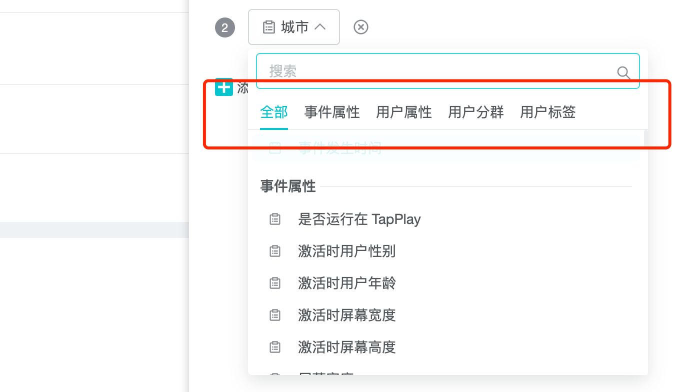
Differences in data logic:
- Event properties: Parameters for each event. For example, the "Mid-Autumn Festival" event is transmitted through the SDK, which has three properties: "the number of Mid-Autumn Festival props", "the type of zongzi" and "the number of dragon boats purchased by the user". When selecting the dimensions of an event property, the available dimensions are constrained by the selected event, for example, if the event is selected as "Mid-Autumn Festival", the event property can only select these three.
- User attributes: Fields in the user table. User attributes are not constrained by the selected event.
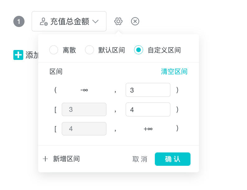
When the selected dimension is a numeric field, such as payment amount, there will be the selection of interval. The discrete interval means that the aggregation query is carried out according to all the values of the field. The default interval is the aggregation interval set by the system according to a certain rule, and the custom interval is that the customer can define the interval segment to aggregate data.
When the selected dimension has "event occurrence time", the time can be selected to support by day, hour, minute, week, month.
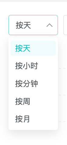
4.3 Select Date
Select the date we care about.
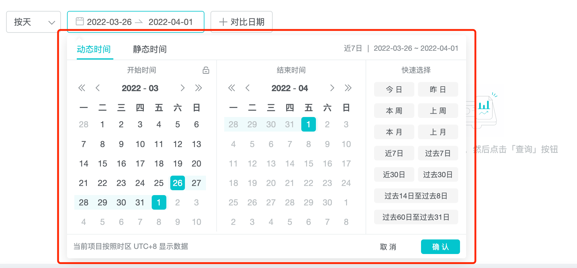
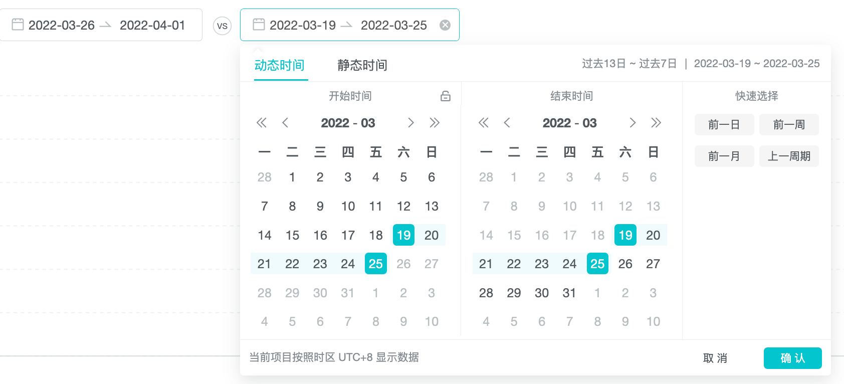
4.4 Select a comparison date
For example, in the example below, if the selected date is 2021-3-2 to 2021-3-8 with an interval of 6 days, then the comparison date interval is also 6 days. When selecting a comparison date, you only need to select one date (e.g. 2021-02-23) and the system will automatically project back 6 days (to 2021-03-01).
4.5 Save Report
After selecting the main dimensions and indicators, click Save Report to save the report, enter the name and confirm, then the report is saved to Saved Reports.
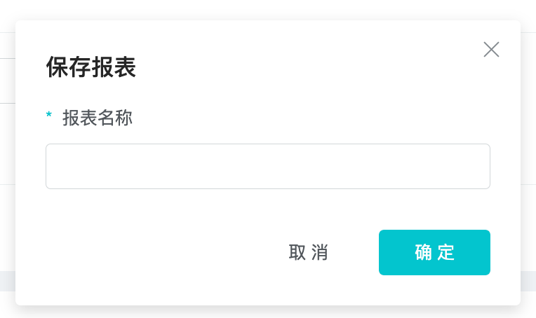
After saving a report for the first time, when you open the report again, the "Save As" button will appear and you can save it as a new report, if you click "Save Report", you are updating the original report.

The saved reports are displayed in My Reports on the right side of the screen.

5. Pivot Table
A pivot table is an interactive form of data reporting that features calculations related to the arrangement of data and pivot tables. It is called a pivot table because the order of the aggregated dimensions of the data can be dynamically changed, thus allowing customers to view the data from multiple perspectives. Below we compare the following two pivot tables.
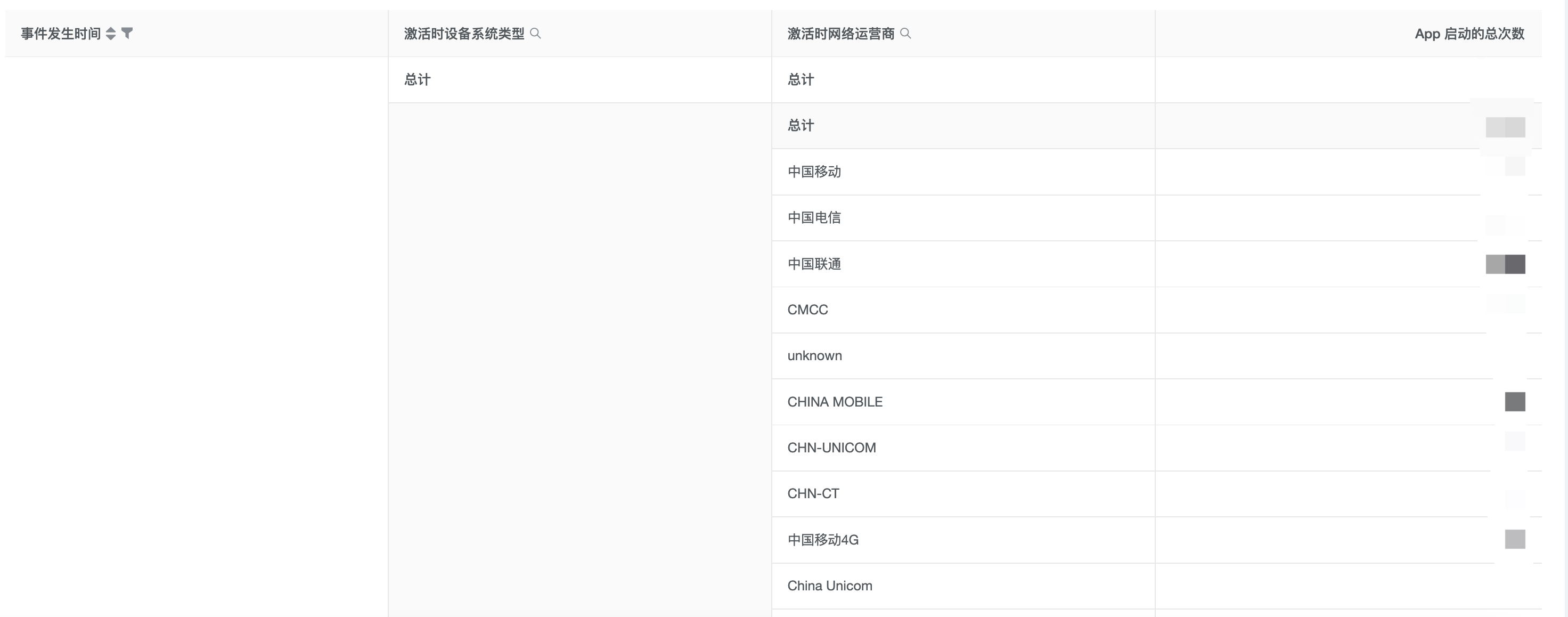
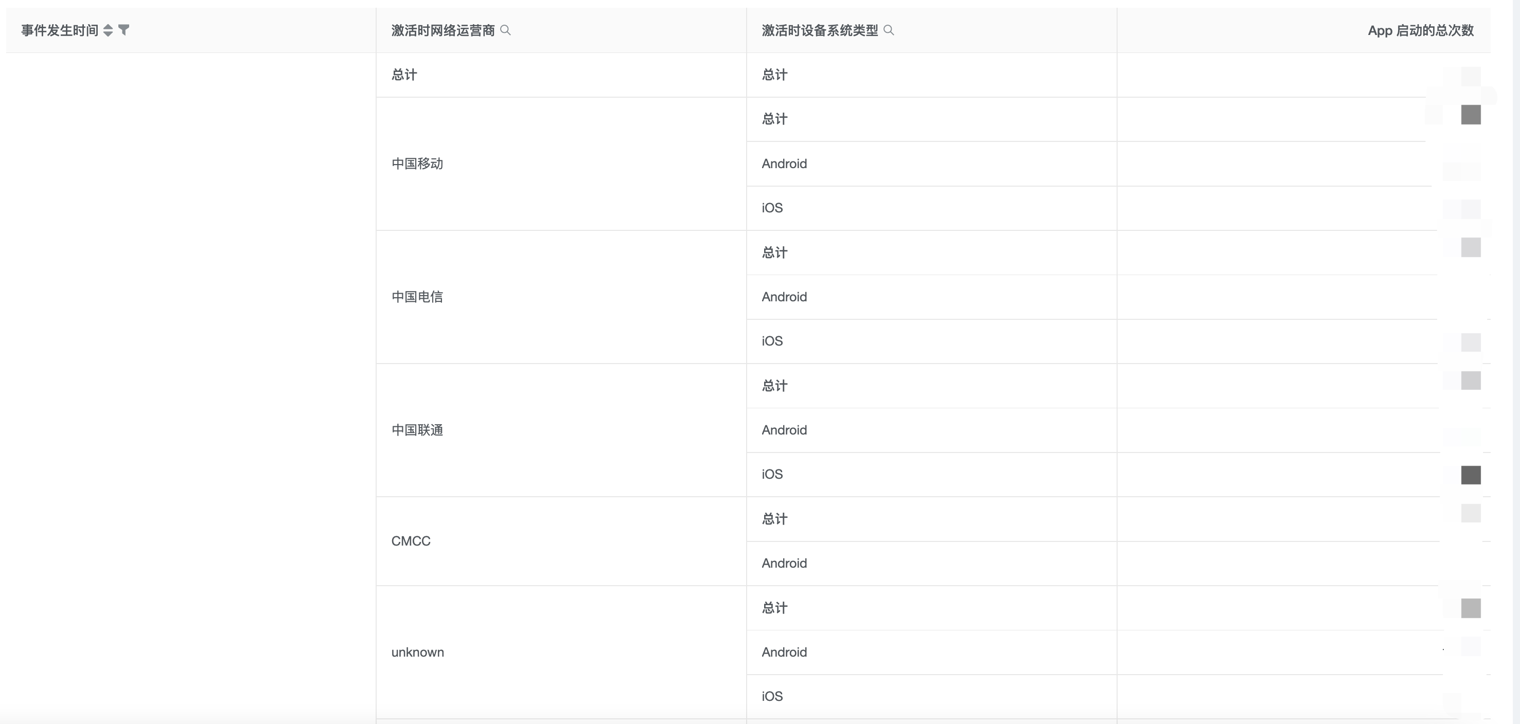
In the first table, we want to query the sum of the recharge amount of users in each province, each device system and each network operator in China. From the perspective of "province", the data of "equipment system" is split, and then the data of "network operator" is split.
In the second table, we want to query the total recharge amount of users in each network operator, each device system, and each province. From the perspective of "network operator", the data of "equipment system" is split, and then the data of "province" is split.
5.1 Draggable
Each column of a pivot table can be dragged and dropped with the mouse to change its order. After the dimensions are dragged out of order, the data re-enters the query. Flexible use of drag and drop can improve the efficiency of data query. Currently, pivottables can be ticked up to 5 dimensions and 20 indicators.
5.2 Search
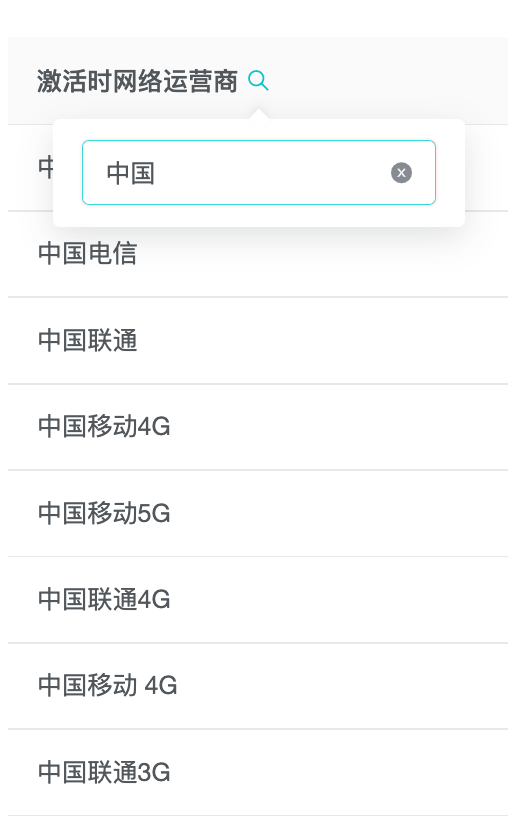
In the dimension header of the pivot table, you can click the search input text, and the search function can help quickly filter out the eligible items. The query is not re-entered after filtering.
5.3 Sort
Default sorting logic for pivottables:
Firstly, the total data of the first column of the main dimension index was sorted from large to small.
Then, the total data of the second column of the main dimension index is sorted from large to small.
And so on, sort the totals for the NTH main dimension indicator from large to small.
5.4 Download Data
Click the download button on the right side of the pivot table to download the tiled data, and the downloaded result is the current query result. What you see is what you get. Available in CSV/PDF/picture format.